
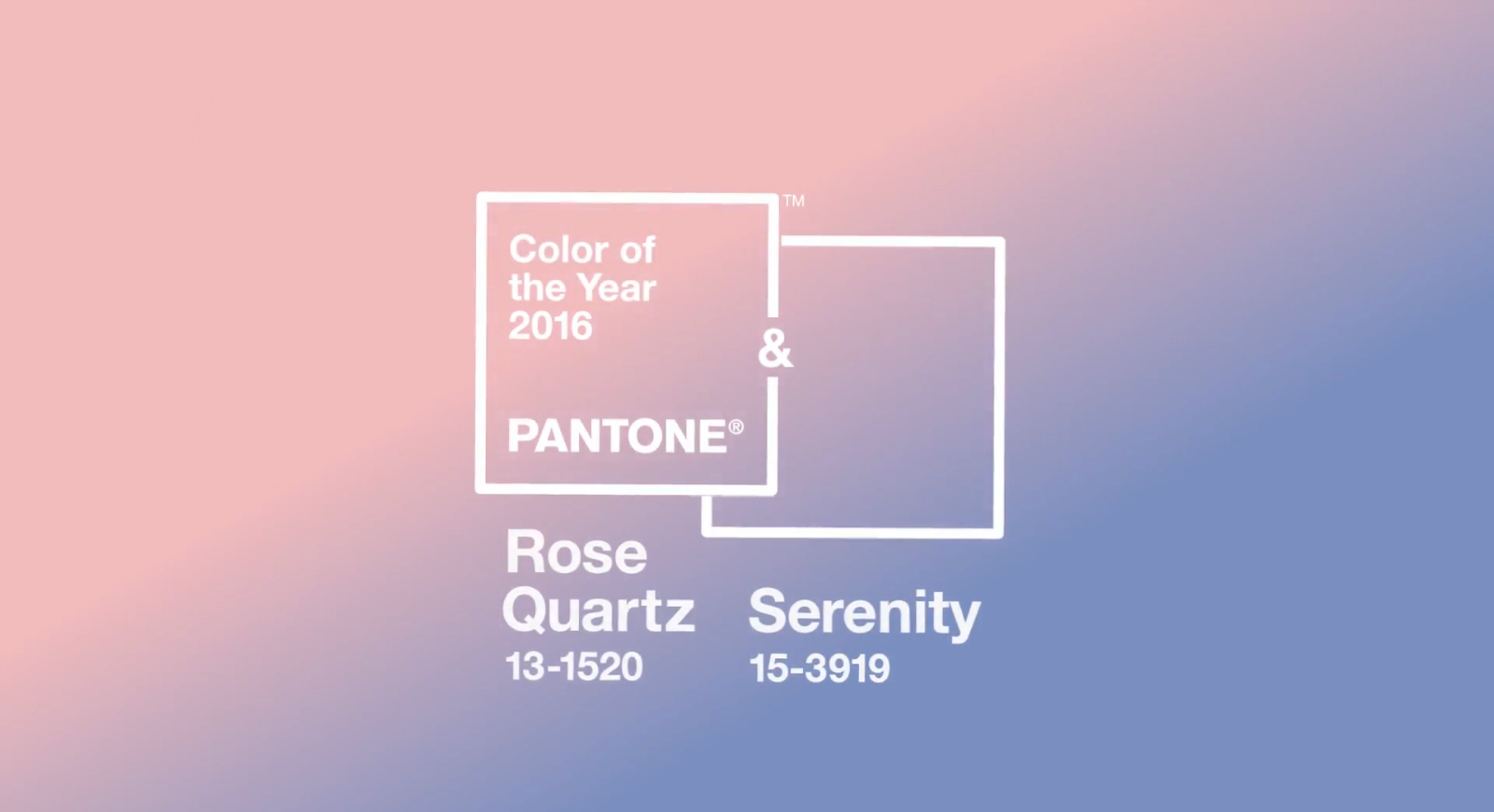
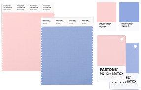
Last week, Pantone announced their colours of the year — they chose two colours for the first time in history! The official Colours of the Year for 2016 are Rose Quartz (a soft pastel pink), and Serenity (a periwinkle pastel blue). Today’s post is an introduction to these shades, including ideas on how to incorporate these colour trends into your personal style for the holidays, as well as inspiration for home decor, fashion and beauty.
I’ve followed Pantone for colour inspiration my entire career — they’re the global colour authority for creative industries. They provide a colour system that ensures colour translates accurately across all mediums, whether it be in fashion, beauty, print, or in design. Pantone also predicts colour trends, so I like to keep up with what they’re forecasting to stay ahead of the curve!
COLOUR INTRODUCTION
Here’s a statement from Leatrice Eiseman (Pantone’s Executive Director) about their colour choices for 2016:
“Joined together, Rose Quartz and Serenity demonstrate an inherent balance between a warmer embracing rose tone and the cooler tranquil blue, reflecting connection and wellness as well as a soothing sense of order and peace.”
I really love Pantone’s choices for 2016! Today’s I’ll be sharing some images from a styled shoot that will give you some introductory ideas or inspiration on how you can incorporate these new colour trends into your personal style and decor.
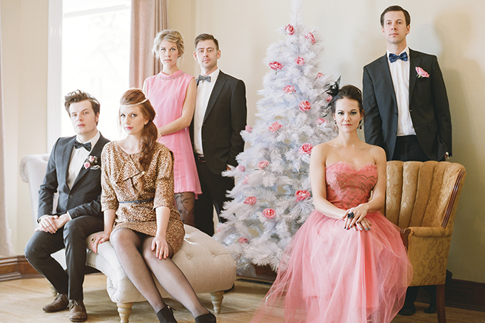
HOLIDAY INSPIRATION
Pantone’s new hues make a perfect holiday palette if you’re looking for something unconventional — it’s icy, crisp and balanced.
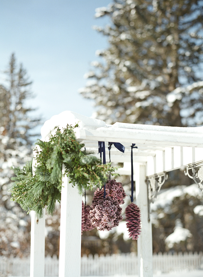
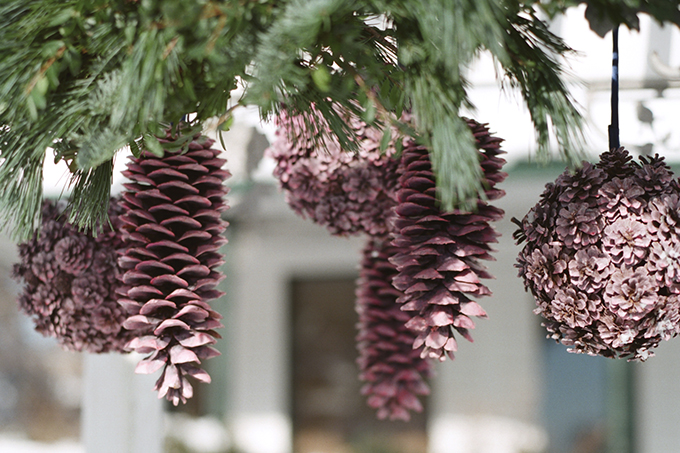
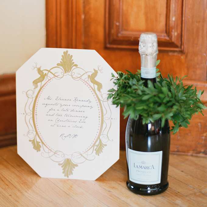
Try adding pops of pink and blue to traditional holiday decor for a unique twist (and modern update!). How adorable are these hanging pink pinecones?
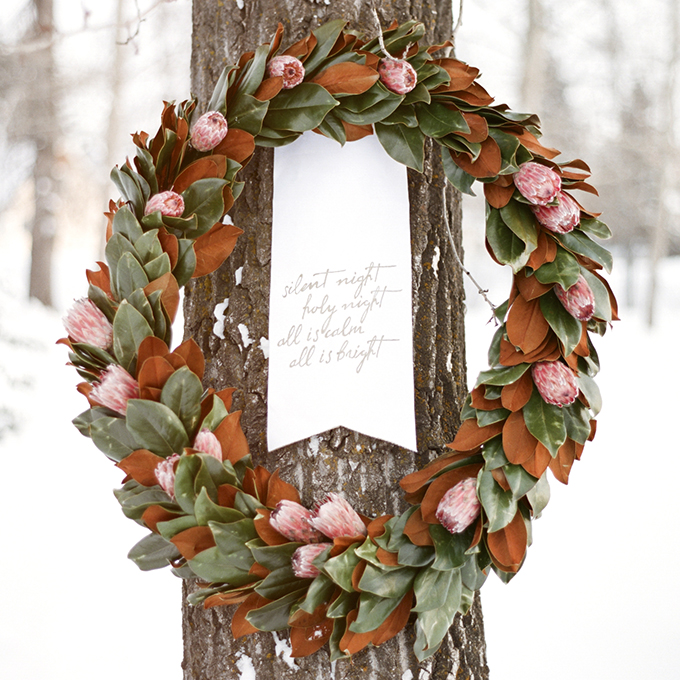
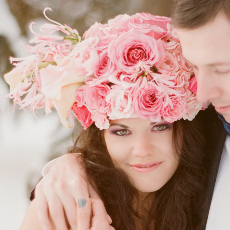
Rose Quartz floral accents bring a breath of fresh air to traditional holiday wreaths as well.
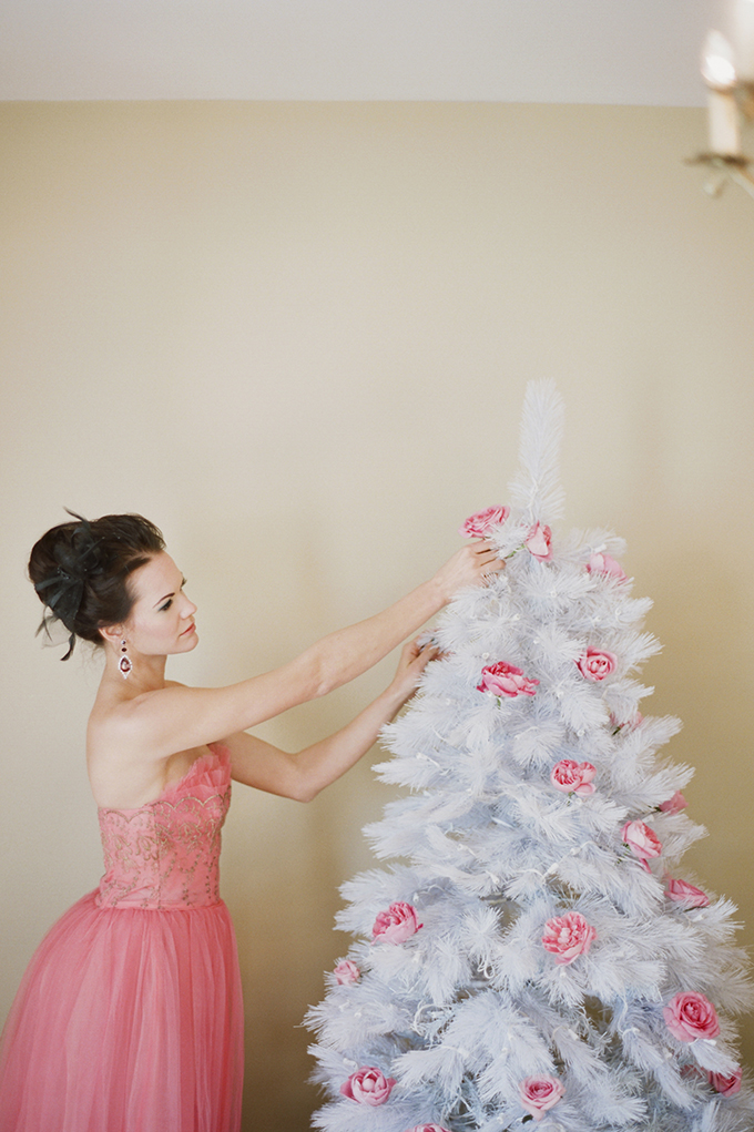
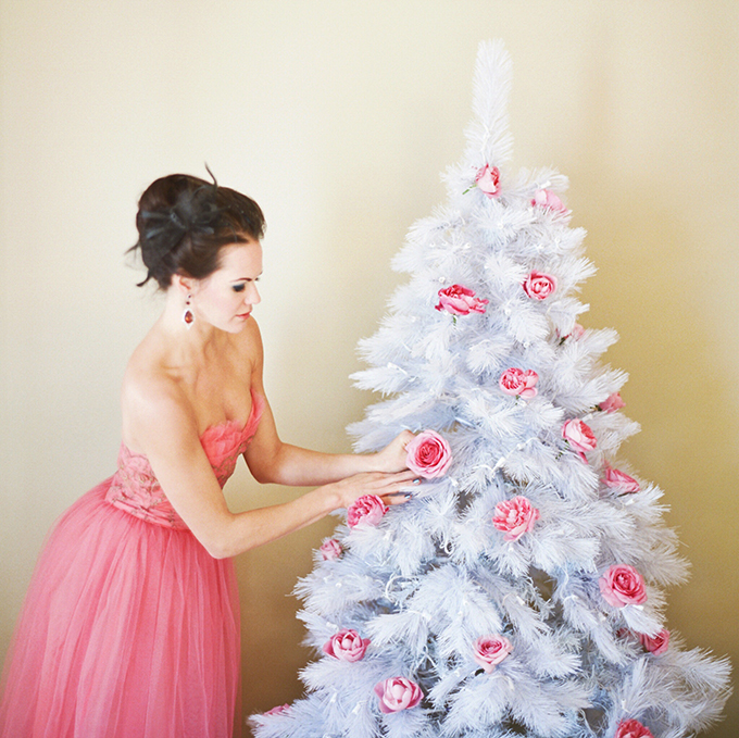
We’ve been seeing a resurgence of white, vintage inspired holiday trees for the last few years. Why not trim your tree with some fresh tea roses? It’s a minimalistic (what decorations?), unique approach and a great opportunity to embrace the colour trend.
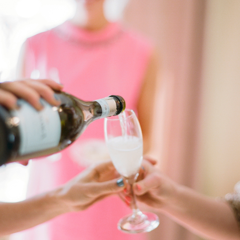
DECOR & ENTERTAINING
Pops of pastel decor and floral accents are a simple way to freshen up a space, or liven up your holiday decor! These icy pinks and blues pair well with fresh greenery and crisp winter whites, as well as silver, gold, and amber accents.
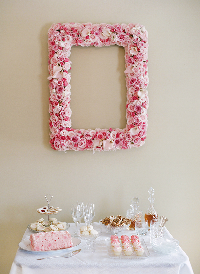
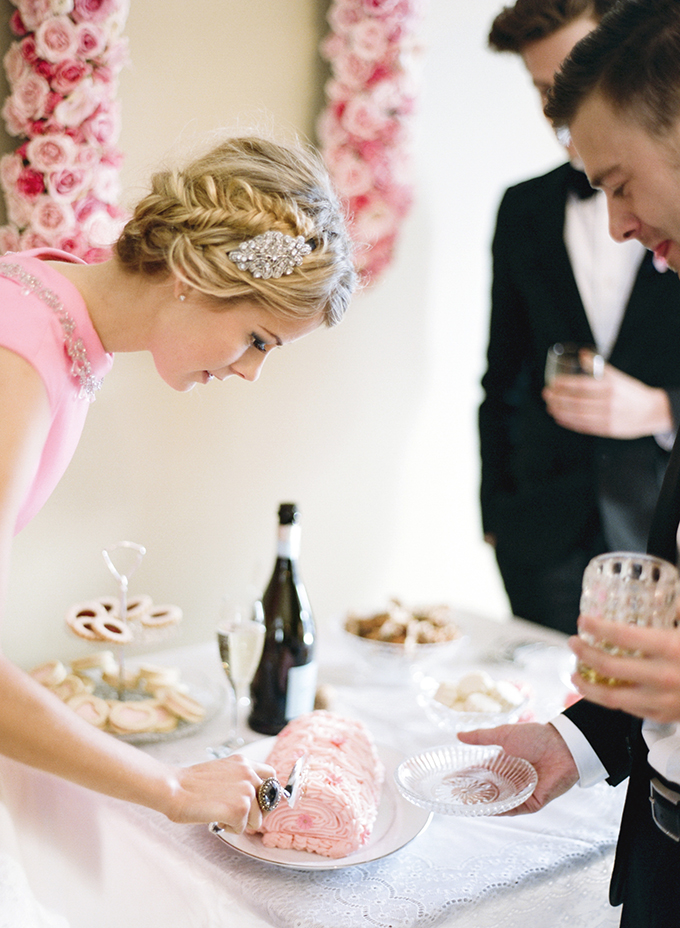
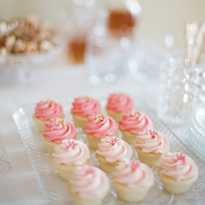
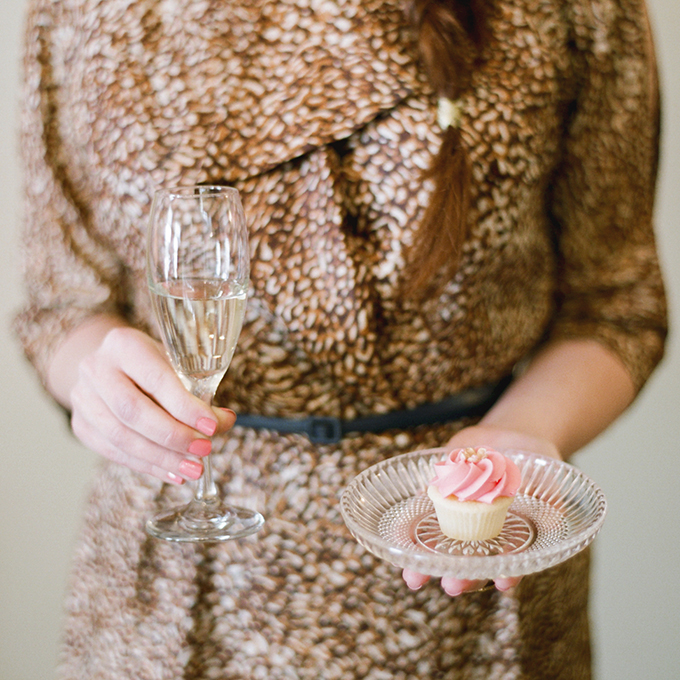
Try some pink icing on your holiday baking! Or serve holiday treats in a palette of Rose Quartz and Serenity for something a bit different.
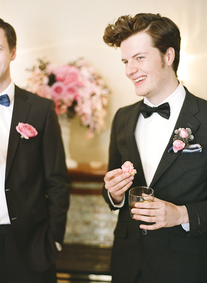
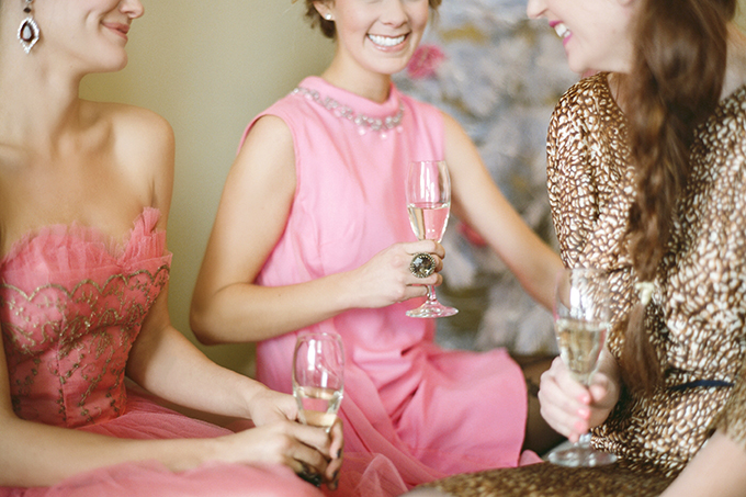
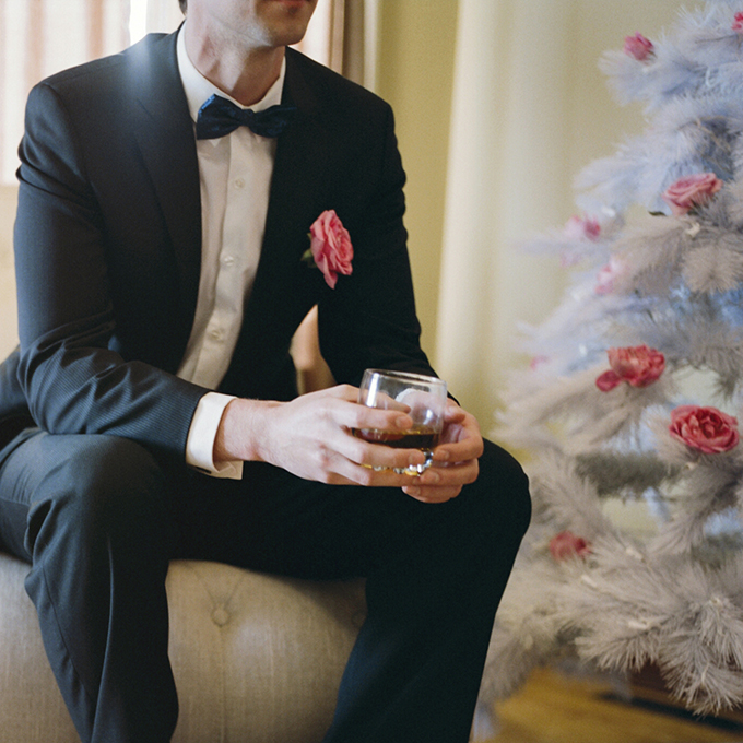
FASHION
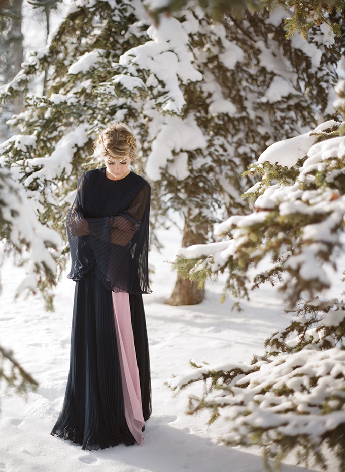
Since this palette is inherently masculine and feminine, it works well in fashion for everyone. Rose Quartz is a great shade to pair with neutrals, and with Serenity. There’s so much balance and duality in this palette!
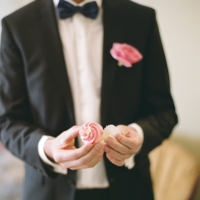
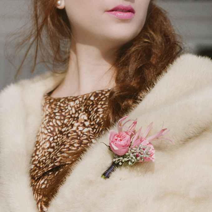
How fresh is this navy blue bowtie with a Rose Quartz boutineer?
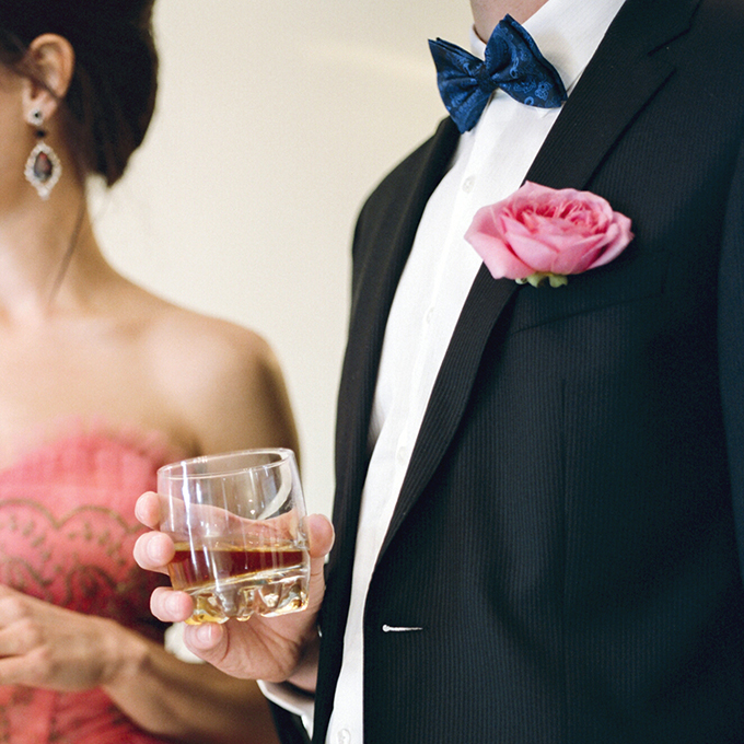
Just a pop of Rose Quartz can liven up a monochromatic palette. We especially like it complimented by navy.
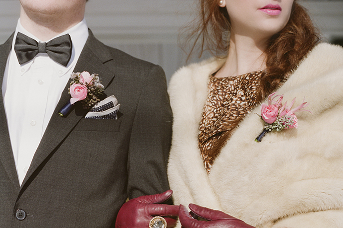
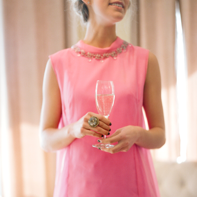
Rose Quartz has a sophistication about it when paired with darker neutrals.
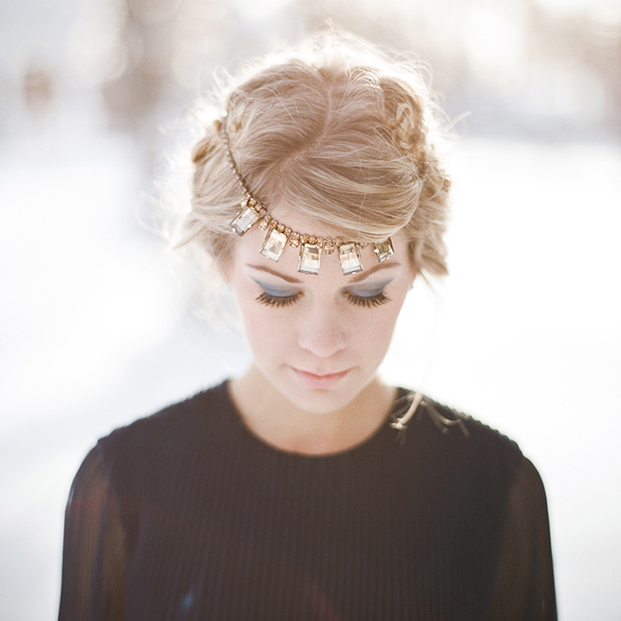
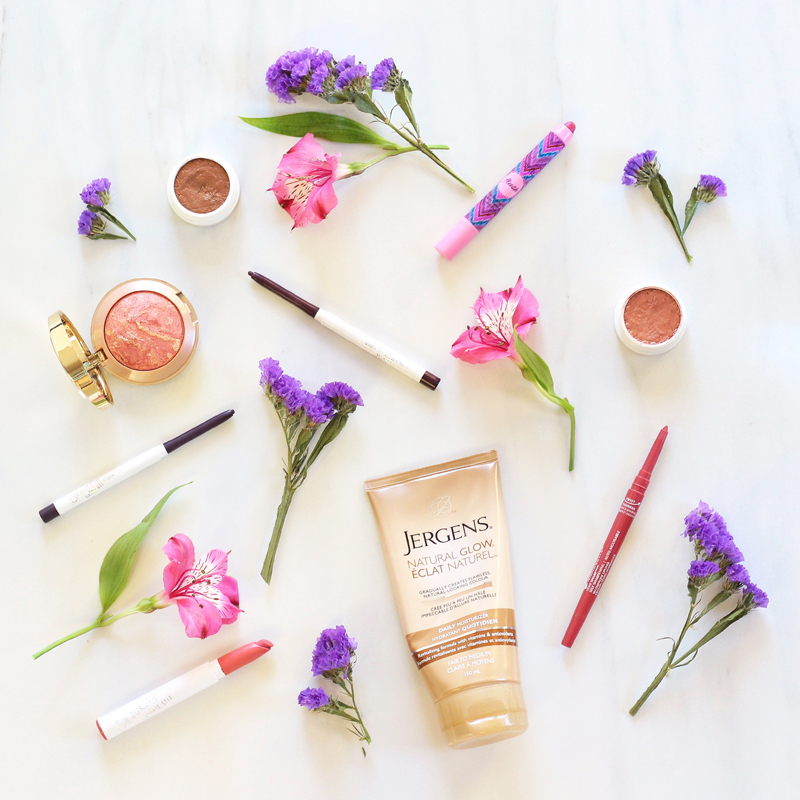
BEAUTY
Both Rose Quartz and Serenity translate well to beauty — which I love! I think adding on-trend hues to your beauty routine is such a fun and inexpensive way to update your look.
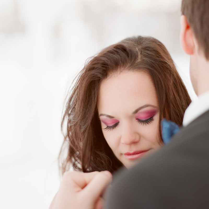
I’m a fan of pinks on the lips, eyes and nails — Rose Quartz is a very soft and wearable shade. To ease into the trend, try a Rose Quartz lip as an alternative to a traditional nude — pale pinks flatter most skintones and can really liven up the complexion! Or, look for a polish in the Rose Quartz family for your next manicure or pedicure.
If you’re feeling especially daring, you can always try more intense pink hues on the eyes. They’re surprisingly flattering on every eye colour! Robin has hazel eyes and they look fantastic on her. Ground the look with a darker eyeliner, and be sure to blend out bolder colours with neutral shades to keep things wearable.
Serenity is a little bit less versatile than Rose Quartz in the beauty department, but I think it’s a beautiful, cooler alternative to a classic smokey eye. Blue hues compliment brown eyes especially, but also look great on blue and grey eyes. I also like icy blues for my nails this time of year. Serenity acts as a cool neutral and will pair well with pretty much anything you’ll be wearing!
How do you feel about Pantone’s colour choices for 2016? Will you be embracing these colour trends? I have a few post ideas for the New Year planned for more inspiration on incorporating these colour trends into your personal style, but if there’s anything specific you’d like to see, please leave me a comment!
Thank you to all the talented creative professionals who contributed to this shoot!
Photography | Gabe McClintock
Concept, Flowers & Decor | Rebecca Dawn Flower Design
Fashion & Beauty Styling & Creative Direction | Justine Celina Maguire
Styling & Creative Direction | Pink & Honey (assisted by Brooklynne Gladysz)
Cake & Desserts | Crave Cookies & Cupcakes
Paper Goods | Uh Oh My Deer
Hair & Makeup | Claire Marjanen Makeup (assisted by Whitney Wong)
Models | Kendra Robinson, Robin Moodie, Lauren Zakaluzny, Adam Conrad, Terrence Coonan and Jared Maguire
Official Pantone Graphics | Source
Disclaimer: This post is not sponsored, and contains my genuine thoughts, ideas and recommendations.
15 Comments
Beautiful color combination! And the pictures are stunning!
Thanks so much, Ilona! I’m glad you enjoyed it. Happy holidays!
Whoa! You’re an amazing photographer! I love every single one of these photos- looks like it was a lot of fun!!
Hi Candice, thanks for the comment! This is actually one of the few posts on the blog I didn’t shoot myself — we worked with the ultra talented Gabe McClintock on this shoot. He’s linked above in the shoot credits if you’d like to check out more of his work. It was so much fun! I love to collaborate with other creative professionals to make pretty things. ☺️
I think 2016 might be my year. I love quartz – that vintage dress with the diamond collar is so gorg. Just beautiful colors.
It think pantone has got it bang on.
Kellie from Princess and the Yard Ape
Thanks so much, Kellie! I like Pantone’s choices for 2016 too, although I did love 2015’s Marsala. This was such a fun shoot to style — isn’t that dress so pretty? I just love good vintage. 🙂 Wishing you the best in 2016!
[…] you so much to Atsumi at Frilly Lilly Mission for my beautiful Pantone Rose Quartz inspired gel manicure! The shade I’m wearing is Juliet. If you’re looking for last minute gift […]
[…] you so much to Atsumi at Frilly Lilly Mission for my beautiful Pantone Rose Quartz inspired gel manicure! The shade I’m wearing in this post is Juliet. If you’re looking for last […]
[…] all things pastel was solidified by the Pantone 2016 Colour of the Year Announcement (check out my inspiration post for some colour trend eye candy), so today I’m sharing a pastel-themed fashion post with you! […]
[…] you think it’s a little overboard that I’ve already started incorporating 2016’s colour trends into my food?! Haha. I can’t really help it — when I’m inspired by something it […]
[…] my Blogiversary month (JustineCelina turned one on March 2nd!) you’ll notice a strong Rose Quartz and Serenity theme on the blog this month leading up to my celebratory post. I’m super inspired by the […]
hello I have to make a cake with the two colors, I don’t find anywhere those food colors can you help me what colors should I mix to get rose quartz and serenity, thank you
Hi Gloria! I reached out to the ladies at Crave Cookies & Cupcakes who created custom icing shades for the Rose Quartz & Serenity cupcakes in this post and here’s what they said they used:
Rose Quartz: add “Rose” gel food colour to white icing slowly to achieve desired effect
Serenity: add “Rose”, “Royal Blue” and “Violet” gel food colours to white icing slowly to achieve desired effect.
I hope it’s helpful. Thanks for stopping by!
[…] my wordmark were inspired by a sunset that mimicked Pantone’s Colour(s) of the Year in 2016, Rose Quartz and Serenity. But you’ll notice a spectrum of warm pinks in the wordmark — one of them being a coral […]
[…] Pantone 2016 Colours of the Year Inspiration | Rose Quartz & Serenity […]